Danielle Morris
Menu engineering
Proving you can "UX" anything... redesigning physical print menus to enhance sales for a high street restaurant chain

SECTOR
Hospitality, Menu Engineering
client
Prezzo - a well-known high-street Italian dining brand in the competitive casual dining market.
challenge
Menu engineering strategy for Prezzo: Identify opportunities for optimisation, focusing on enhancing sales. (The client literally requested, "make it easier to choose dishes and spend more.”)
timelines
One month
the team
Senior UX Design & Research (me), Print Designer, PM and the client's brand/TOV expert.
activities
Personas
Desk research - Psychology of menus
Competitor analysis & benchmarking
Focus groups with diners (in-person)
Codesign workshops with TOV and brand team
Stakeholder presentations
Physical print menu design (Menu Engineering)
outcomes
A menu with a "focus on dining, not fueling": A simple, clear, concise menu that facilitates analysis and decision-making and guides the customer towards ordering multiple courses, specials and more expensive items.
Without access to sales data and in the absence of eye-tracking research or subsequent focus groups, it's difficult to assess the impact of the new design. However, the client was so happy with the redesign that they commissioned the agency for additional work, reappraising the brand's digital identity.
the challenge
Prezzo, a prominent Italian dining brand the competitive casual dining sector, is continuously adapting its brand and offerings to remain current. They approached us seeking how to enhance their printed menus. Their goal was to create a straightforward menu that simplifies the ordering process, while also boosting sales in terms of both volume and profitable items, without losing their vision:"Italian dining with a touch of class."
"Make it easier to choose dishes and spend more...”
"... a focus on dining,
not fueling.”
What we did
Developed profiles (personas) for various types of diners based on the demographics supplied by the client. Subsequently, ran focus groups with 'adult friend groups', couples, and other categories to critique a variety of menus, including the client's offerings.


Following extensive desk research into the theory of menu psychology, I conducted a competitor analysis and benchmarking exercise. Using a scientific, behavioural approach to menu benchmarking, I analysed the menu designs of Prezzo and 3 key competitors through a behavioural lens. The analysis focused on concepts including Salience, Visual Shortcuts and Priming, Choice Architecture, Cognitive Ease, and Verbal Cues.
Against these criteria, Prezzo ranked last against all 3 competitors in the casual Italian dining space. So, lots of opportunities to improve!
menu engineering
Applying the principles of menu psychology, the learnings from the benchmarking and focus groups and examining menus from other (non-competitor) brands, I generated a series of proposals to optimise the Prezzo print menu.
To enhance the dining experience and drive purchasing, I aimed to reinforce the menu's strengths (descriptions that leverage authority bias and no £ signs, which dials down the pain of paying), and tackle the weaknesses like high cognitive load due to 75 menu items, a complex pricing matrix, and price alignment that encouraged comparison.
I advised the client to leverage the clear opportunities to increase cognitive ease and simplify visual mental shortcuts.
Recommendations included:
-
changing the physical format of the menu so it is easier to hold and process visually
-
changing the section order so the more profitable set menu is in the main fixation point on basic focal maps, and scan paths follow the dining story chronologically, encouraging the ordering of multiple courses
-
grouping items that are usually ordered together (e.g. drinks & nibbles)
-
applying anchoring and order effect theories to how prices are displayed
-
Adding visual personality to an otherwise bland design - if you only saw the inside of the current menu, you wouldn't know what brand it represented. Adding visual primes like watermark images to profitable sections can increase sales by 30% (Guegen et al, 2012)
-
leveraging section descriptions instead of repetition of info per item to reduce visual clutter and combat choice anxiety
-
swapping a confusing matrix that over-emphasises prices for nested pricing, so the focus is on the food, not the cost
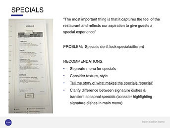
-
ditching the stuck-on 'specials' menu that was often missing or dirty, and moving specials to a separate menu or board.


outcomes
Once the final scope was agreed with the client, I could move forward with co-designing the menu with the client's brand expert and our in-house print designer.
The clients weren't keen on all the suggestions; for example, the separate 'specials' menu. Probing further, we discovered that the main menus are reprinted at the same time as the 'specials' insert (seasonally), so we suggested printing it directly onto the main menu, and matching the design to a 'seasonal' print for the front and back covers to make it stand out.
Together, we created a menu with a focus on dining, not fueling: A simple, clear, concise menu that is easy to read and guides the customer towards ordering multiple courses, specials and more expensive items.
By applying the principles of menu engineering and the outcomes of the customer testing, we created an adaptable template that can be reused every season.
If the client had had a bigger budget and longer timescales, I would have suggested eye-tracking research and focus groups to assess the impact of the design changes and iterate on the template.

old
-
3-panel format is difficult to control
-
75 menu items causing high cognitive load and choice paralysis (e.g. optional meal upgrades listed as separate meals)
-
complex pricing matrix
-
price alignment encourages comparison based on cost
-
items that are sold together are not grouped together e.g. side s & mains
-
dirty or missing "specials" section
NEW
-
2-panel format is easier to hold & scan
-
salience, visual shortcuts and priming: Diners' attention is driven by what is most salient, using visual shortcuts to aid decision-making, and visual elements to prime diners and make profitable sections like 'specials' more distinctive and more memorable
-
choice Architecture: Consumer decisions are influenced by how choices are presented, accounting for anchors and biases like order effects, extremeness aversion, and status quo bias
-
nested pricing lets diners focus on the food not the cost
-
a flexible template that can be updated each season with a new pattern and relvant dishes
2
